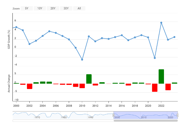
The blue line graph shows the fluctuation of yearly GDP growth, while the bar chart shows whether the annual change was positive (green) or negative (red).